mindful
beta
Mindful is a personal notepad that follows you throughout your day. It’s always available where you are: in your browser’s next tab.
The premise
Mindful is a side-project that came out of my year-long obsession with developing text-editors. It’s available as an extension for Chrome.
“The only notes you remember are the ones you see.” The project was inspired by nobel-prize winning psychologist Daniel Kahneman’s concept called what you see is all there is (WYSIATI).
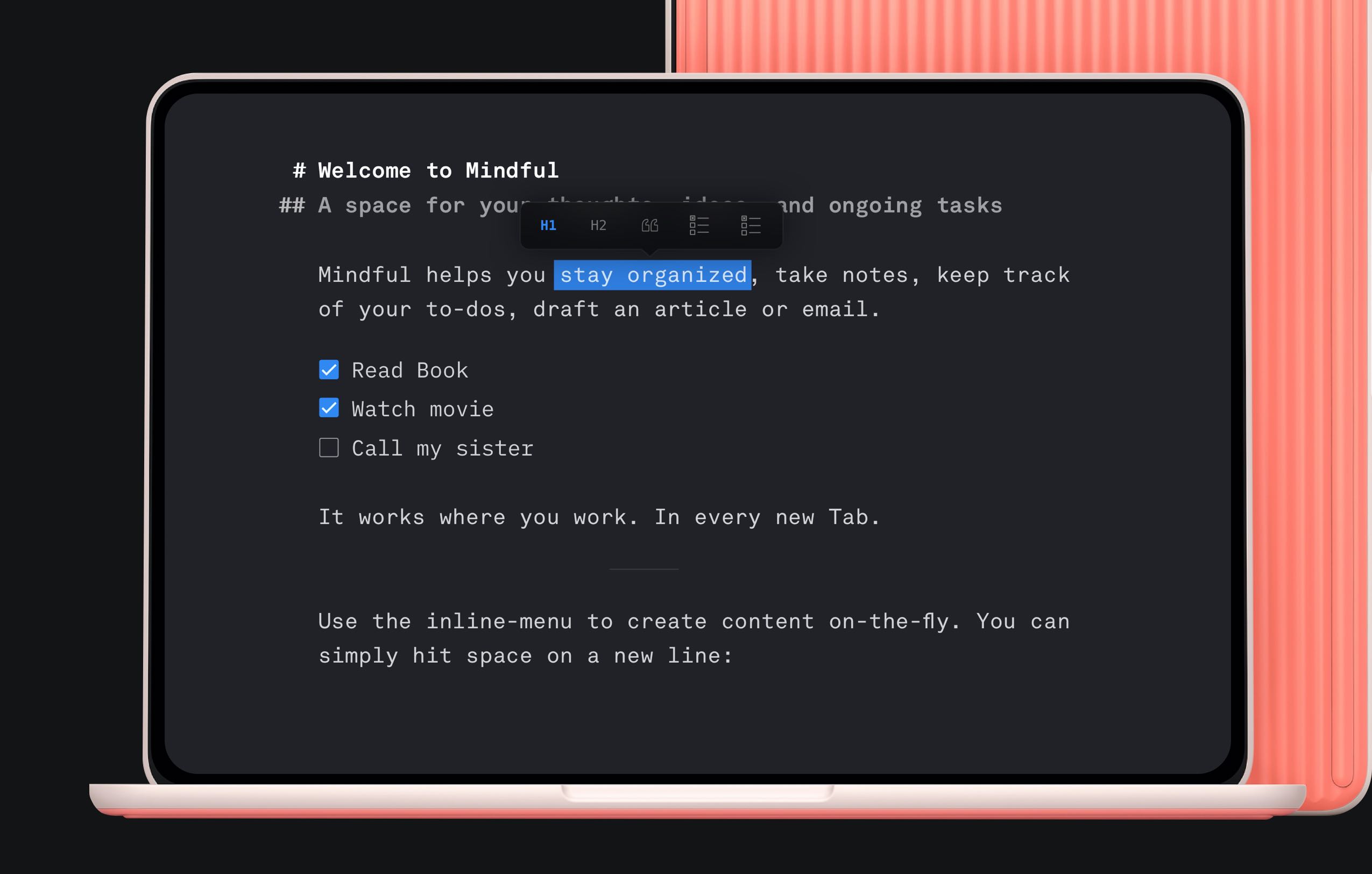
Mindful is limited by design. No files. No folders. No organization. What remains is one single sheet with all your ideas, thoughts, and ongoing tasks.
Essentials
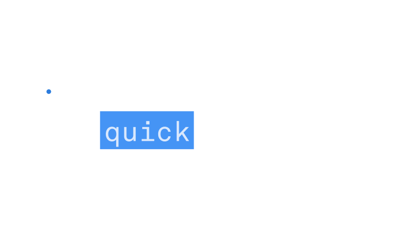
A text editor is composed of only two essential user interface elements: a blinking cursor and the text itself. In a minimalist writing environment, the typeface inadvertently becomes the most distinctive part of the UI.
Akkurat Mono by Swiss type designer Laurenz Brunner with its tall x-height serves as the foundation of the upcoming new version. Many small details and playful elements like the lowercase g and a make your notes look playful and sophisticated at the same time.
Mindful is based on a text-editor framework that I’ve been working on for years. It was originally conceived for storytelling / and content blocks style narratives on the web.
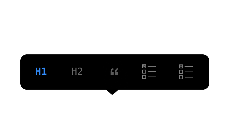
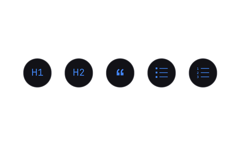
It features a floating-bubble, an inline-menu, and the context-aware dots.
These elements came in handily to have a UI that’s helpful when needed, and invisible when not.
No one ever starts a new sentence with the SPACE key. The space key is universally accessible, and even more importantly, one of the most fun keys to tap on. This gave birth to the idea of the inline-menu.
Hitting space on a new line, allows for on the fly creation of content. This whole UI is fully keyboard navigatable, effectively eliminating the need to ever use the mouse
Upcoming mobile app
With Mindful’s positive reception on Product Hunt and it‘s early ~15k daily active user, it always felt like the missing piece was a mobile companion app.
The app builds on the concept of one single note file and features a contextual keyboard that adapts to where the cursor is within the text.
Iconography & Brand
As part of the re-launch, I updated the brand and the logo mark as well as its iconography. The visual language was an extension of Akkurat itself, mirroring stroke-width and its playfulness
I developed two visual directions. The first one was an analog language inspired by ink and the messiness of thoughts. The second was designed to feel flat, minimal, and digitally "native". I ended up going with the second option.
To this day, I consider text editors one of the hardest things you can build. It’s so simple and so ubiquitous that we have stopped noticing how complex they are.
There are still a myriad of small bugs in Mindful, but if you feel adventurous and would like to test the upcoming new version, hit me up on twitter. You can check the old version here.